Edited by Lewis at 2020-7-3 15:05
I've written some getting started guides on data visualization, like this post The Simplest FineReport Dashboard Tutorial for Beginners! This time I will share with you the specific steps to make an advanced sales dashboard, from the determination of indicators, layout design, chart types to dynamic effects.
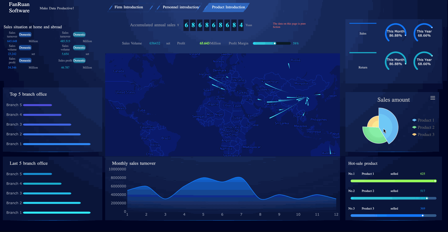
Here is the dashboard style we are going to make.
1. Determine Analytical Indicators
Watching the sales dashboard, you may be attracted by the cool visualization. However, keep in mind that the dashboard must be based on the presentation of data, and any cool effects cannot affect the effective display of data. So, we should first considerate which data and which indicators should be put on the dashboard. You can use the key metric decomposition method to determine which data to display.
Step 1: Identify a key indicator. For sales dashboards, your total sales must be the most important, which is the theme. Step 2: Decompose the key indicator from multiple dimensions, that is, break down your sales.
- From the time dimension. What is the sales situation for each quarter or month? Why are the sales particularly high in some time periods? What measures have been taken?
- From the geography dimension. What is the sales situation in each region? What is their ranking?
- From the planning dimension. What is the difference between the current sales and the previous plan?
- From the proportion dimension. What is the sales of each product? Which are the most profitable star products?
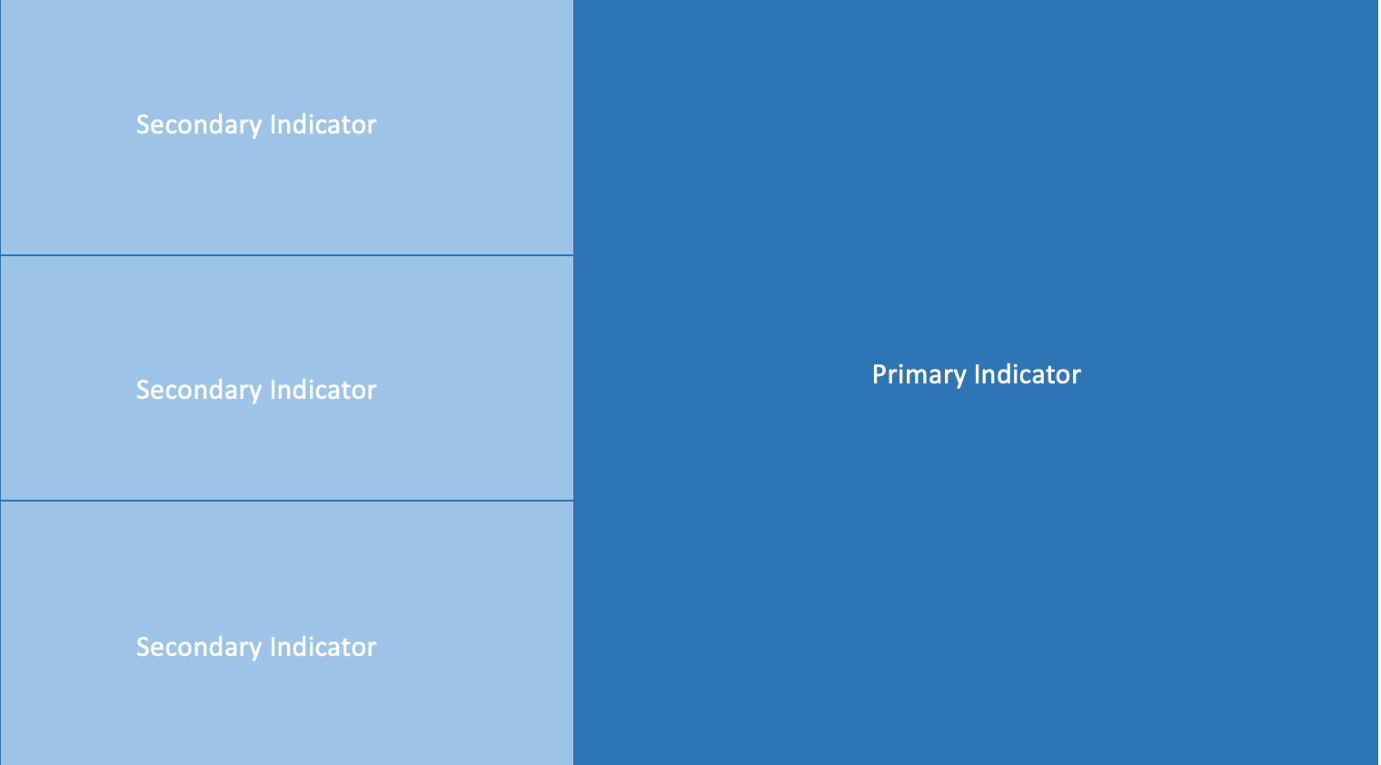
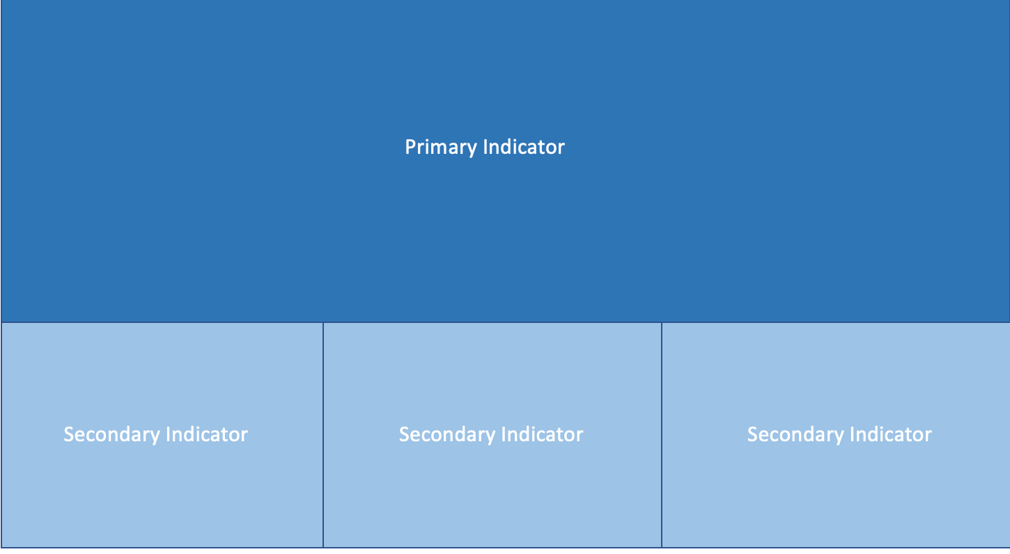
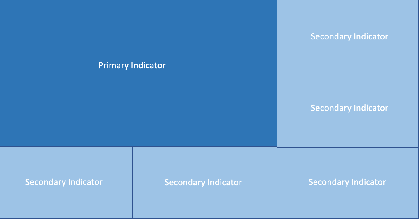
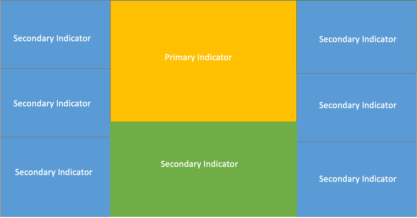
2. Design Layout
Under normal circumstances, an indicator monopolizes an area on the dashboard, so through the definition of key indicators, you know what content will be displayed on the dashboard, and how many pieces the dashboard will be divided into. And you can determine the importance of the indicators based on the business scenario and then design the layout of the dashboard.
The purpose of the layout is to reasonably present business metrics and data. There are primary and secondary indicators. The primary indicators reflect the core business, and the secondary indicators are used for further elaboration, so they are given different weights when designing the layout.
Here I recommend several common layouts.
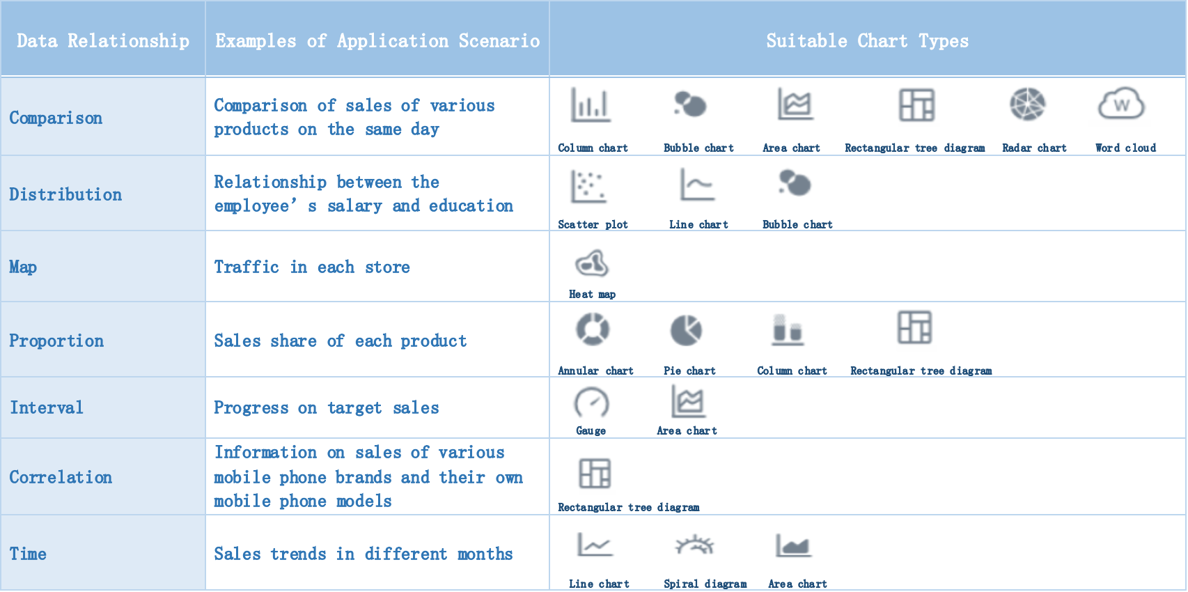
3. Select Chart Types
After the key indicators are determined, we need to determine the analytical dimensions of the indicators. Whether the data can be analyzed thoroughly and whether it can provide support for decision-making depend on the analysis dimension of the indicator. Our common analytical methods are analogy, trend, distribution, composition, etc. The choice of analytical methods depends on the actual business scenarios.
Taking the data of the shopping mall as an example, I’ll show you how to select the right chart type.
4. Add Dynamic Effects
Dynamic effects are an important part of visualization. They make the whole dashboard more attractive. But excessive dynamism dazzles viewers and it can’t highlight the key information. Therefore, we need to pay attention to the proportion of dynamic design. The range of dynamic effects is wide. There are dynamic images, page rotation, list scrolling, real-time data changes, and so on. The following are some built-in dynamic effects of FineReport.


Practice
The above are the basic steps to make a dashboard. Having said that, I will show you how I use FineReport to make a sales dashboard.
① Import dataFirst, we prepare the data and import it into FineReport Designer. The data here is fictitious because I use the built-in dataset of FineReport.
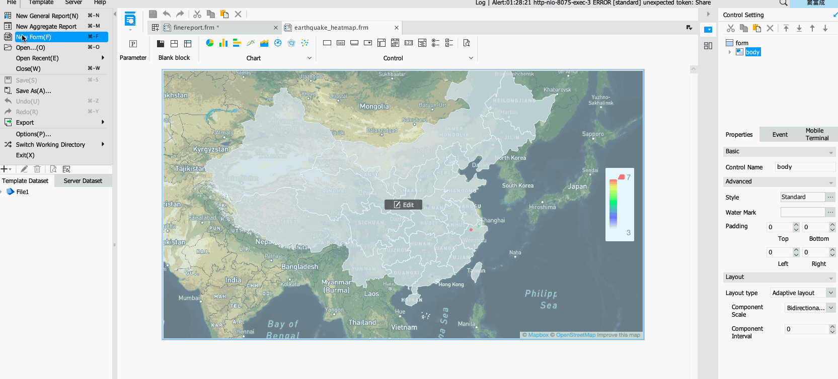
As shown in the figure below, in the real scene, we need to connect various databases to import data.
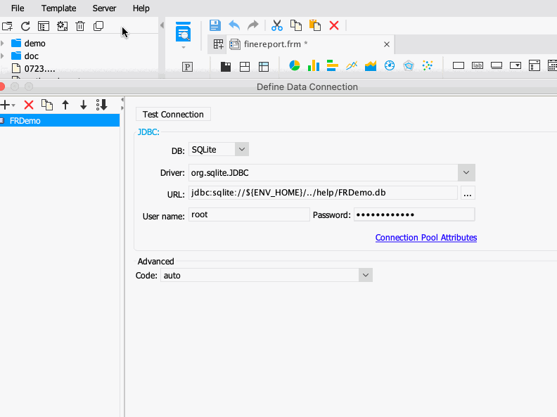
The connected data can be a common relational database, or it can be file data like Excel. And FineReport supports connection to big data platforms.
② Make a template
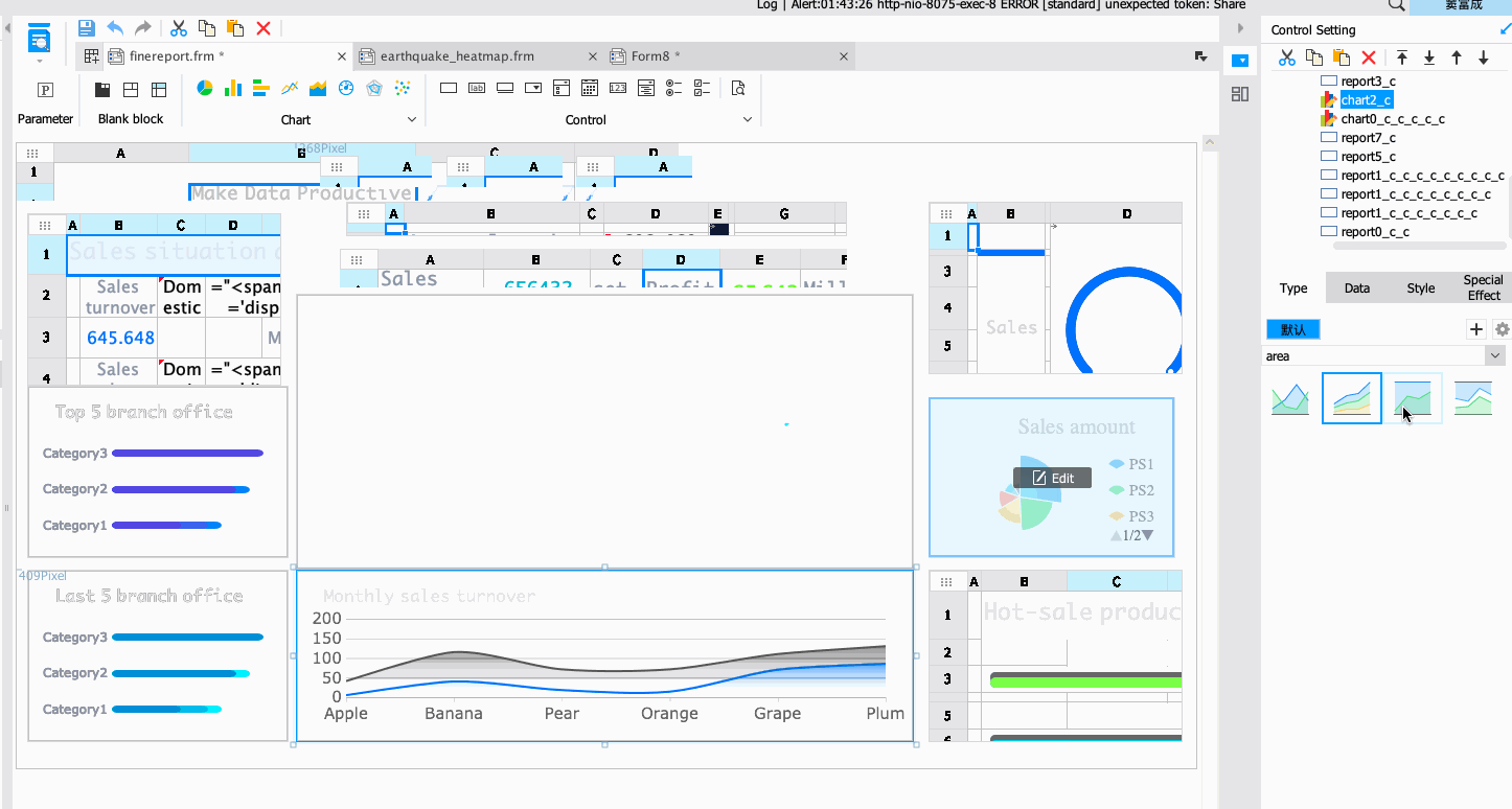
Once the data is ready, the next step is the creation of the template. At first, I create a blank template, as shown below. The principle is to drag and drop a visual component (such as a chart) on the blank template, and then bind the data.
Before we start, we need to think about what sales data we want to show on this blank interface. After careful consideration, I design the following layout. The middle is the main theme, and the left and right sides are sub-themes.
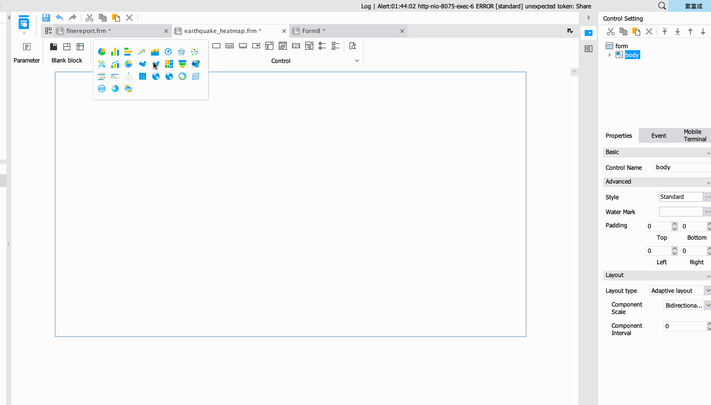
③ Select visualization elements
For sales, we first analyze the quantitative indicators. Drag and drop tables and charts to display as shown above.
Choose the right chart style on FineReport Designer and connect the data imported in the beginning.
④ Add dynamic effects
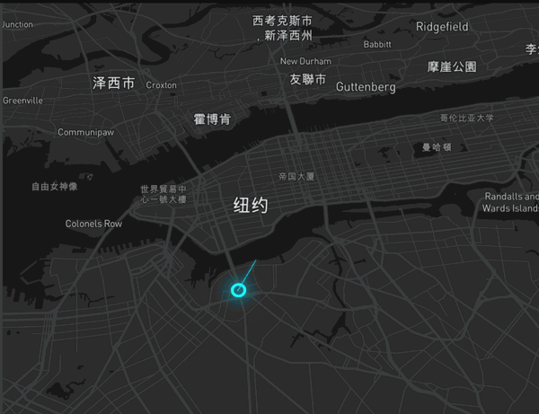
In this sales dashboard, I add a flow map to show the distribution of sales operations nationwide or globally.
The dynamic effect is shown in the figure below, and the data is the latitude and longitude information of the sales location.

Finally, after a series of landscaping settings, the dashboard is completed.
Finally, I would like to say that it is not difficult to make a dashboard. Above all, we must find out the key indicators for the nature of business operations, and let the leaders see the value of the data. That is the most important step in data visualization. | 


 Give full play to the advantages of a unified platform to deeply mine data resources