How can we create a heat map without writing a single line of code?
Today I will show you how to use FineReport to make an earthquake heat map without writing code.
First of all, let me show you the final effect of the earthquake map. The picture shows the distribution and magnitude of the earthquakes between 1999 and 2019.
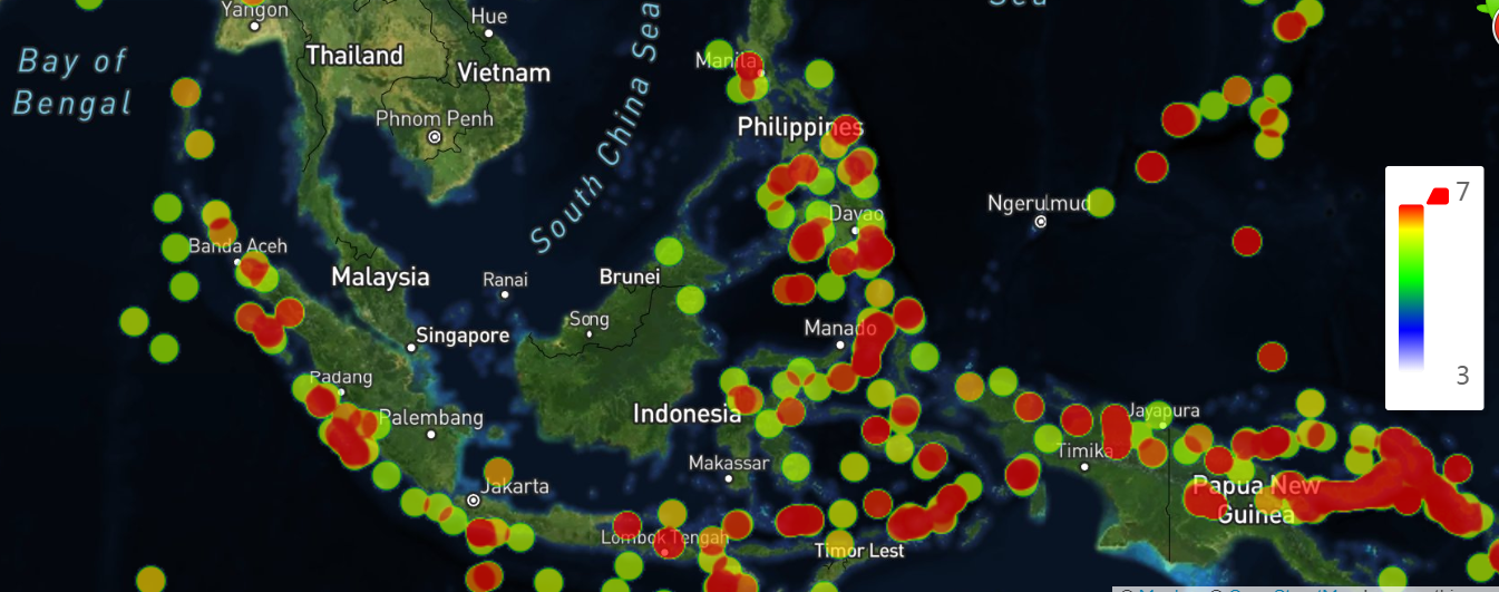
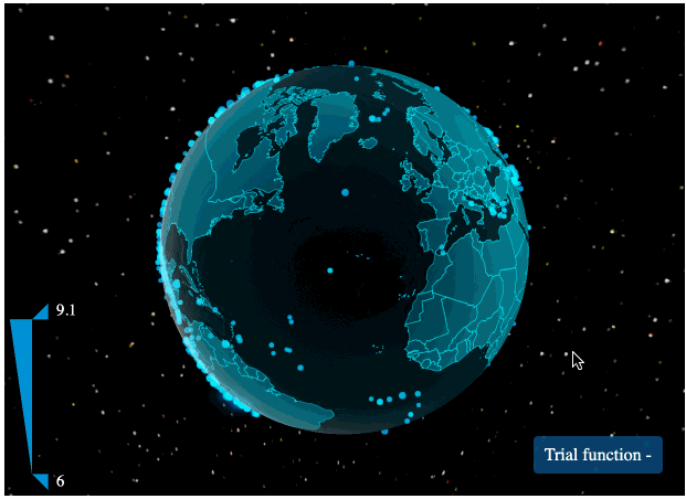
The screenshot above only shows earthquakes in Southeast Asia. I also made a 3D dynamic heat map showing the global distribution of earthquakes. And I didn’t use any code during the production process.
Now, let’s start learning how to visualize the data.
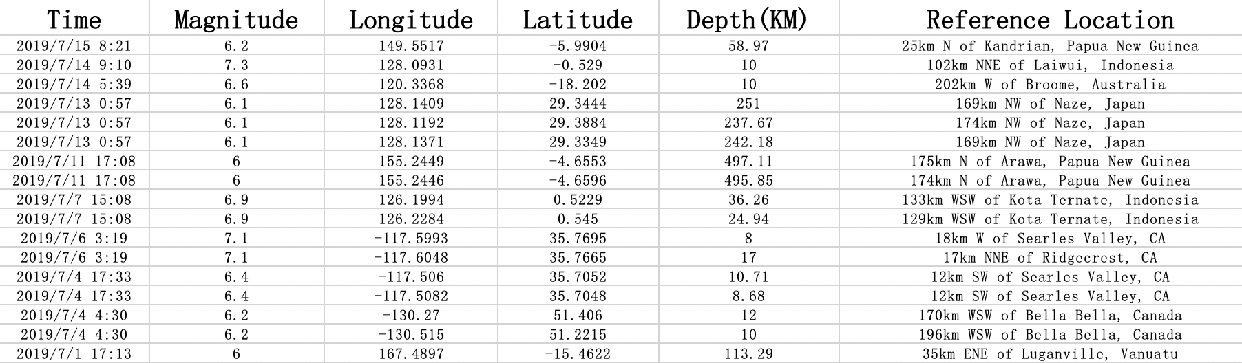
The first step is to find the source of the data. We can obtain the data of various regions for the earthquake heat map from USGS. In this article, we take the world’s seismic data from 1999 to 2019 and import it into Excel, and then edit it into a unified format as shown below.
Next, we import the data into the FineReport Designer.
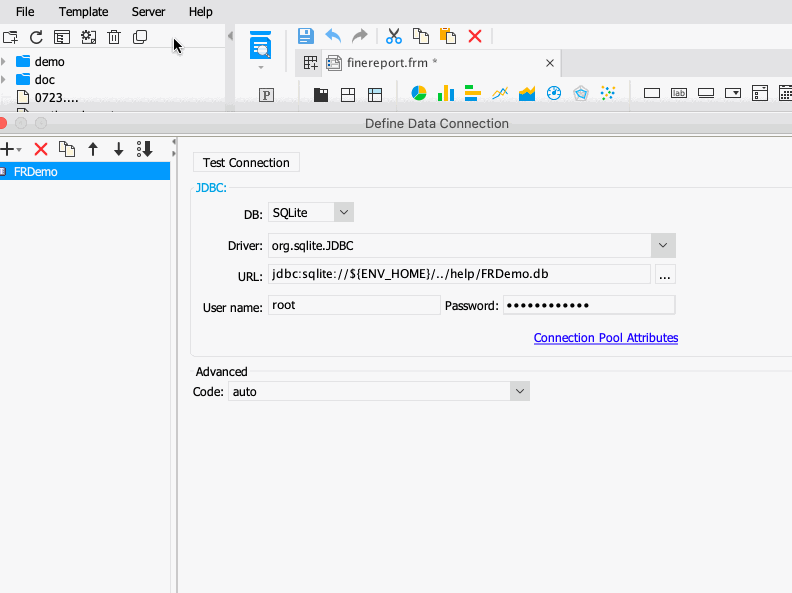
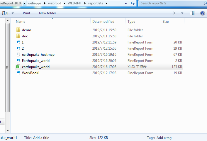
But if the data is from Excel, we need to put the Excel file under the same path of installing FineReport. For example, in my computer, I put the Excel file created above into C:\FineReport_10.0\webapps\webroot\WEB-INF\reportlets, as a built-in template.
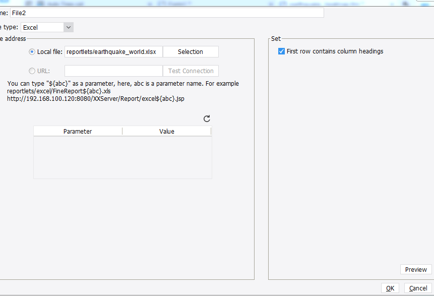
Then open the FineReport Designer, you will find your Excel file. Select File, set File type as Excel, choose Local file, select the excel file just imported, on the right side select “First row contains column headings”, and then the data is imported.
We create a New Form to design the dashboard and select the heat map in Chart, as shown below.
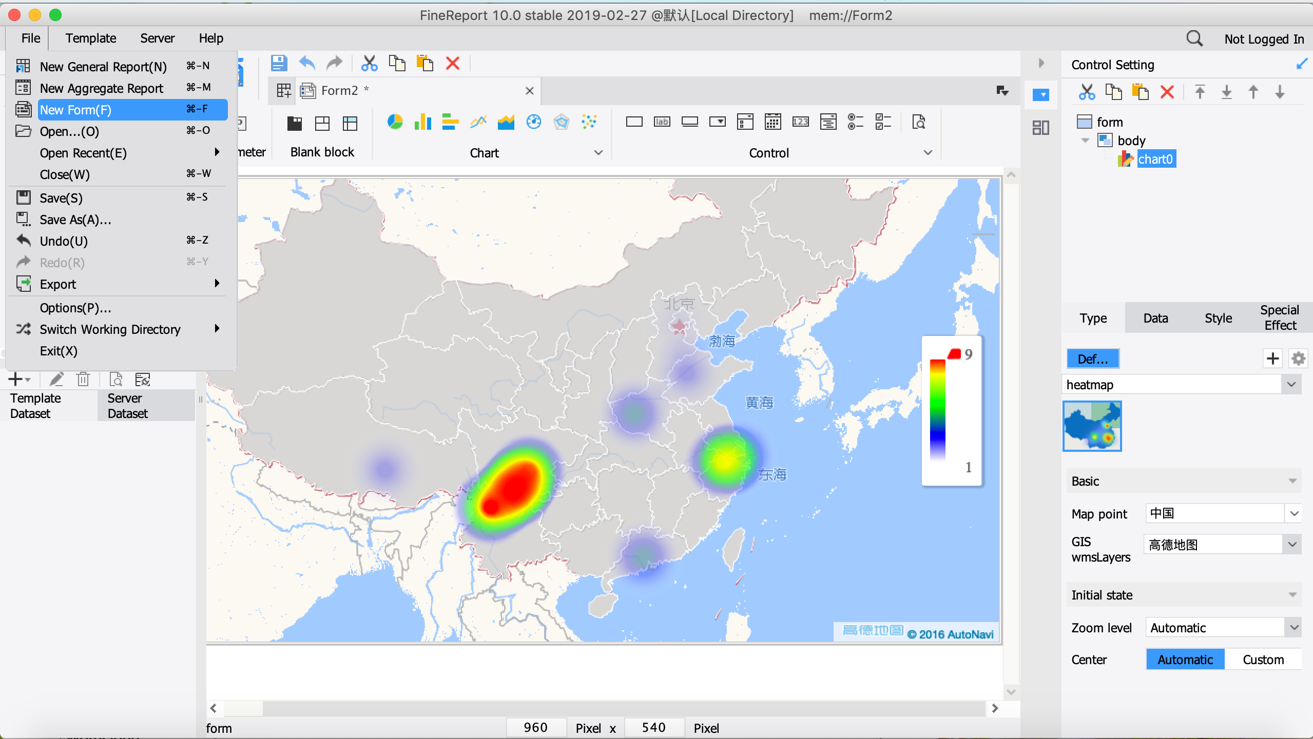
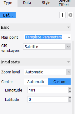
Click on the map to edit. Select Map point, here I choose Template Parameters, then select the GIS layers to choose Satellite. You can set the center point of the map display. Here I choose (101,0) to display, with Southeast Asia as the center.
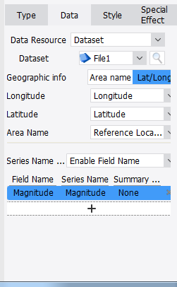
Then import the data into the map. The settings are as follows.
At last, we adjust the style of heat map.
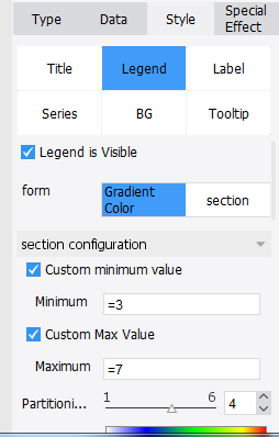
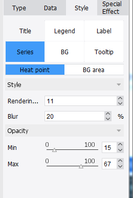
The legend is set to a gradient color by default. You can define the maximum and minimum according to your needs. Select Chart Property Table -> Style -> Series, you can see that the series properties are divided into two settings: Heat point and BG area. If the boundary/point selected by the user does not contain the boundary information, the setting is invalid. The series interface of the thermal point is as follows: the larger the rendering radius, the larger the display range of the heat region; the greater the blur, the higher the blur of the heat boundary. Opacity minimum and maximum, corresponding to the opacity of the minimum and maximum values in the graph, set here as follows.
Click on the preview and a heat map without coding is done.

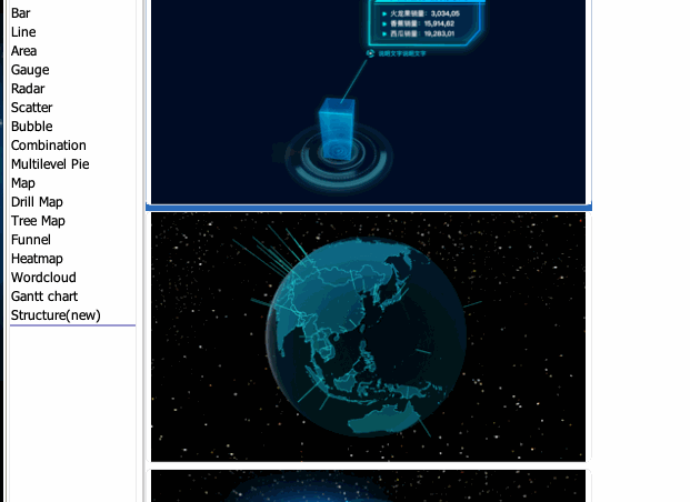
Seeing here, you may ask how the 3D dynamic heat map at the beginning of the article was made. It is very simple. Just select Structure(new) when inserting the chart. And I think you can explore the subsequent settings by yourself, which are similar to the above steps.
| Welcome to FineReport Community (https://community.finereport.com/) | Powered by Discuz! X3.2 |